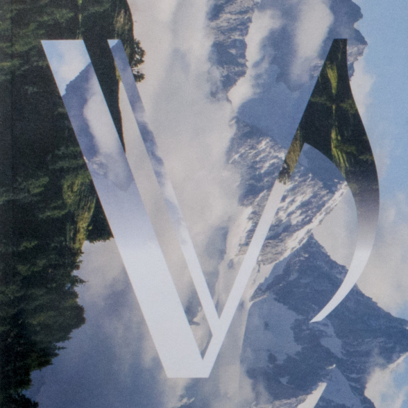
Numerous avenues emerged during our research, some promising, others less satisfactory... Playful for one, taking up the line of the drawings that Picasso made without lifting his brush; figurative for the other which is interested in the intense look of the artist and where the initial P becomes a nose in the middle of the figure; it is finally the one that seemed to us the most favourable to the development of a real identity that we chose: the shift.


The sign that we propose expresses a disturbance. Pablo Picasso has marked in an absolute way the history of art, and even the social or political history, we imagine him as the crystallization point of a deep rupture. This sign is also the result of a contrast between a form of rusticity and a very great precision. By introducing the grain of sand, it creates a question but does not answer it, it invites to the glance by sharpening the appetites.
For the kinetic dimension of this sign, the letters slide against each other. The movement is translated by the black and the white which give its frankness to the plastic expression.
We were looking for a way to make the singularity of the artist, his work and his importance sensitive. But we also worked with the context of the museum: the sign expresses with strength and simplicity a "Picasso mystery" but it also resonates with the architecture of the museum. It thus participates in the formal language of the museum's volumetry and recesses.
To describe the sign we have created, everyone will find the term that seems most appropriate: break, rupture, fault, shift...
It is a sign which is not exhausted and whose perception is renewed according to the points of view.


The graphic charter is based on a stripped graphic vocabulary in which the shift can find constantly renewed declinations for all applications that the agency has developed: signage, publishing, motion design ...