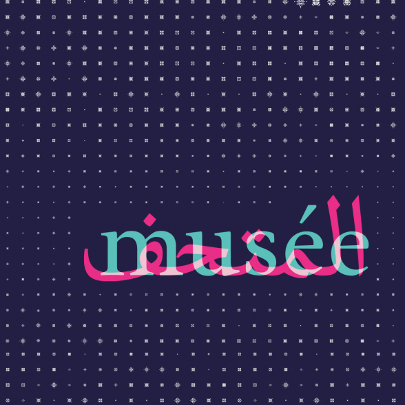
The typefaces we have created are a first in France. Our team worked on an unprecedented project: to create a typeface that would allow a concordance between the Arabic and Latin alphabets.
It is designed to facilitate the use of bi- or trilingual typographic compositions. The goal was to find a coherence between the two scripts to harmonize the text and at the same time facilitate the transition from one to the other, making its use fluid in its various applications.
The typeface is called "Mondara". Available in several fonts of different weights, it is adapted to all uses in communication, publishing and signage. It is completed by a set of pictograms and ornamental motifs. We had to give priority to the question of "working type", to offer a comfortable reading experience, and in this sense we rely on both cultural and technical requirements.
Thus, the source of inspiration of the Roman is to be found on the side of Garaldes, such as Garamond, Granjon, etc. Its alter ego in Arabic is the Naskh, whose design keeps the calligraphic trace and corresponds well to the current writing model used today. This project of cultural encounter is the fruit of a team gathered around the agency c-album.