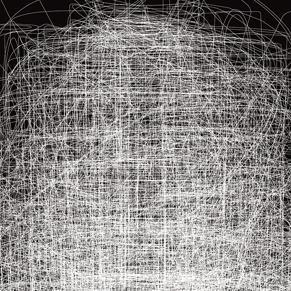
The visual identity of the adagp was based on this particular design of the A, which gives it a playful musical connotation.
We thought it would be interesting to continue this emphasis on the "a", while stripping it of its stylistic effects. We proposed a letter design where the "a" is surrounded and revealed. The choice of typography was made on the "a" of the Minuscule font, with its very particular layout. Indeed, this typeface was developed for use in very small sizes, which seemed relevant to the adagp for its signature in photo credits, long articles of contracts. The Minuscule font is also relevant because its design is contemporary, out of the ordinary, with geometrical shapes that give it its originality and highlight the idea of creation.


The new identity of the adagp is based on an editorial principle: amusing comments on the rights of artists, these adages become identity signatures.
Two versions of the Minuscule font alternate. This principle lends itself well to communication media for the general public and to event communication and social networks.


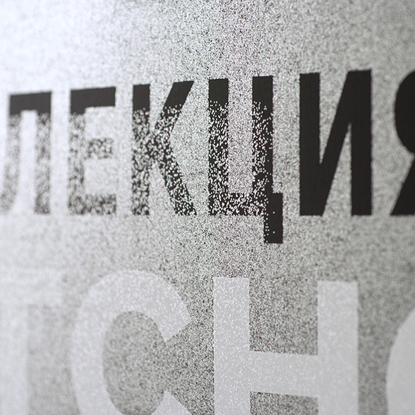
In the continuity of the visual identity based on the use of committed quotations, we designed all the signage around the principle of double reading: the words giving factual information are red and can be seen from a distance; and when the visitor gets closer, he discovers that they are integrated into white sentences: they are poetic, funny, in line with the values of the Adagp.


