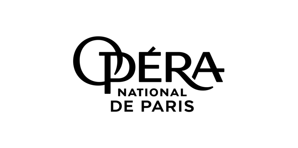
Project, (oh sadly) not retained, of a new visual identity for the Opéra national de Paris. Created in the 1930s, its logo is one of the only French institutional signs to have survived almost intact. It is part of our collective memory and symbolizes excellence and exceptionality.
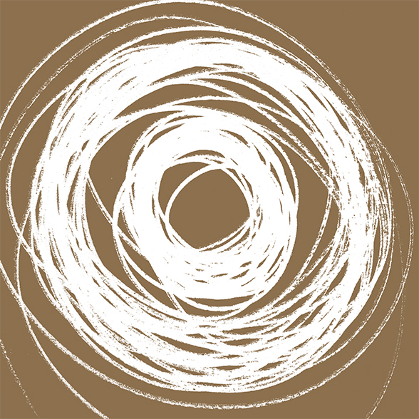
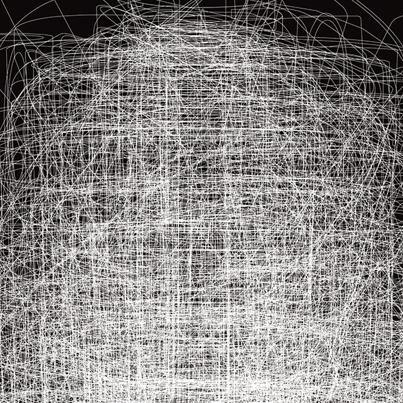
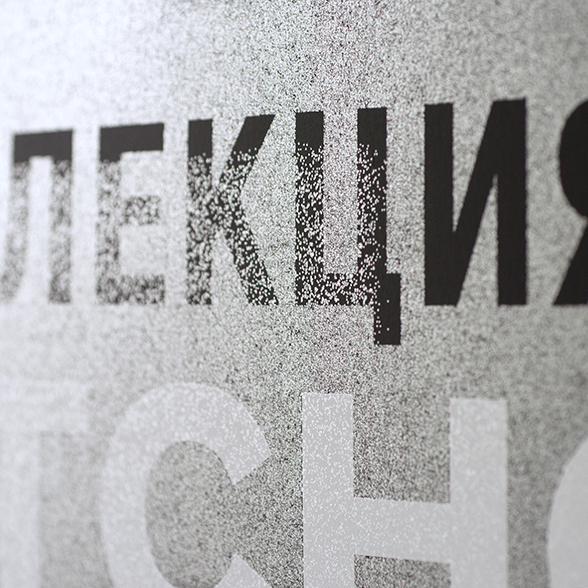
With this in mind, we decided to create a complete typeface from the O and the P forming the precious and unalterable logo. After drawing infinite interlacing, a new typeface was born, ready to deliver the messages of the Paris Opera in a totally identifiable way and respectful of its consubstantial values.


As the Paris Opera is a place of creation par excellence, we decided to deploy communication campaigns that emphasize imagination and emotion. This is why we proposed original visuals illustrated by renowned contemporary artists such as Edouard Baribeaud, Lorenzo Mattotti and Armel Barraud, to enhance the value of the shows while surprising and appealing to diverse audiences.